All Components to use
Text Component
To add a new text component, click on the text button on the right side and drag it to where you want to place it on your newsletter. After placing the component, remove the default language and type in your text.
You can also change the background color of a text component under “Component Detail.”
Image Component
Once an image component has been added to the message, the pop-up below will appear. You can upload images from here by clicking “Upload”. (You can also upload photos to an album under Website > Photos.) Click on the image that you’d like to add, and click “select” to add it to the message.
Alt text can also be added to images, which replace images if they do not appear. This can help with user accessibility for readers.
Like text, you can also hyperlink images to a page by clicking on the hyperlink icon.
Image + Caption Component
Just like the image and text components, you will need to select the photo you would like to use and replace the default text with your language.
Image Group Component
After the albums pop-up appears, select the two images you want to add.
Spacing Component
After clicking on this component option, drag the space component to the desired location in the newsletter. The length on the space component is about one line.
Header Component
Just like text components, click on the text button on the right side and drag it to where you want it in your newsletter. Once added, insert the desired header text for the new section.
Again, you can change the background color of this component by going to “Component Detail.”
Video Component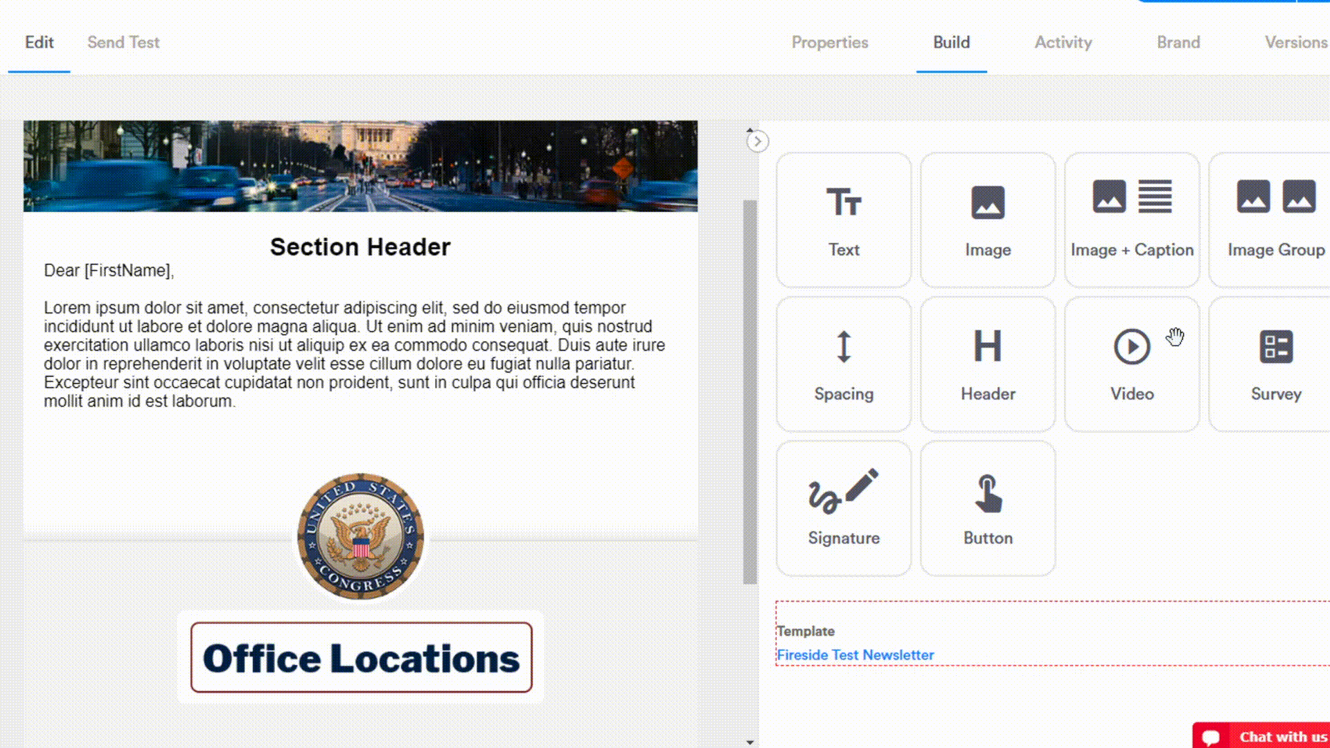
This component allows you to add a linked video to your newsletter. After adding the video component to your message, scroll down the right side of the page to “Component Detail.” Paste the URL to the YouTube video in the field under “Video Source,” and the video will be linked to this component. When constituents click on the video, they will be sent to the page in Youtube. If you want to select a different thumbnail, click on “Browse” to view your Fireside photo albums and add the new image.
Survey Component
Published Fireside surveys (created under Website > Surveys) with one single/multi-select question and one hidden and required yes/no field can be embedded in your message with the survey component. Once the survey component has been added, a modal will appear to allow you to select the survey and its display through the dropdown menus. Buttons, links, and forms are your display options. The colors of the buttons, font, and links and be changed under Component Detail.
Buttons:
Links:
Forms*:
*Not all email clients support the forms option. For example, Outlook supports it in a degraded manner so you’ll see [ ] instead of round radio buttons for each question.
Signature Component
The signature component allows you to add your boss' electronic signature and sign-off anywhere in your message. If you wish to edit the signature, please contact our team.
Button Component
The “Button” component allows you to add a button to your newsletter, and you can link it to any URL. On the right side, you can edit the appearance using the scales and dropdown menu found in the Component Detail section. To change the text of the button, simply click on the default text and insert your language.
Comments
Please sign in to leave a comment.